for designers and react developers..
As designers your must have icons/custom images design to suit the business needs and demands flexibility it the projects. Then later as icons required increases, you will continue build new ones and ship it to the developers to use.
The process repeats thus as business requirement changes and projects. here we will learn how to liquidate the process and version control it.
Depending on the tech stack your company uses. Since this topic is for reacts, points will be beating around those similar tech stack.
Preparation for packages
To prepare your icons for package there are few steps, we will go through it.
1. HD image (vector), and make sure not to large
This part is common, as we know storing png/jpg or any raster formats media as icons is not a good practice since it size is bigger and consume time. (can read further here and decides: https://www.pagecloud.com/blog/web-images-png-vs-jpg-vs-gif-vs-svg).
We know web developers tend to use icons at any size and any moments they want, designers should just leave “what size of these icons should i prepare” for web developers to adapt it to its styling functionality, css, less, etc...
And i would personally recommend SVG as it is vectorize image, which would not break even if enlarge.

2. Initiate your package
You have to at least have the requirements ready. If this is your first time building package, just follow steps below..
Requirements:
- go to github and create accounts (https://github.com/)
- got to npmjs and create accounts (https://www.npmjs.com/)
- install yarn from here depending on your os (https://classic.yarnpkg.com/en/docs/install/)
When everything ready just run below command in your terminal or your cmd .
mkdir neo-icons && cd neo-icons && yarn init -y && yarn add -D @types/node @types/react @types/react-dom babel-core babel-runtime react react-dom typescript rollup rollup-plugin-sass rollup-plugin-typescript2Go to the directory and drag it or open it in any text editor tools you have.. You will see you have 1 files ready package.json , this is the file that will define you package info in other developer projects.

In line 4 you see that its main file is refer to index.js , thus you can change this or just let it be up to your preference. Its a file that you must have for your package to be exported into . Now for our prep, let us prepare our source file. Create a index.tsx in a folder name src.

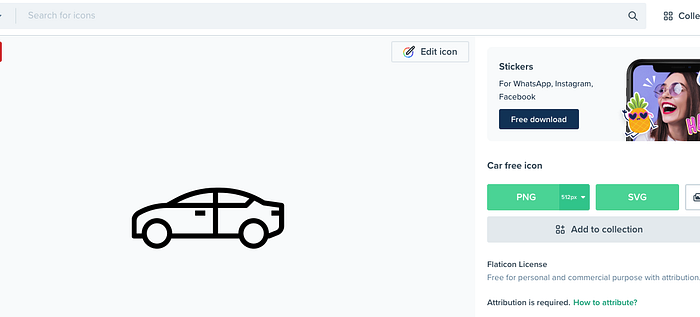
Next let us quickly get an icons up, i will use this car icon as example. You can create your own icons or just get any image you like and convert it to vector.
Flaticon is one of my favorites since there is a lot free stuff there. just download the svg car icon
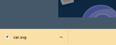
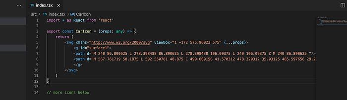
Once downloaded you should get your vector icons. if you try to open the files in any text editor you will see the content of the svg something like below.
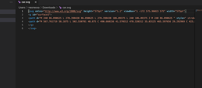
Since we are building package for react, let’s just copy and paste the content into our package. Don’t forget to remove the height width and other unnecessary styles and attribute from the <svg> tag like below. Finally wrap it in an export function, name it whatever you like (we use CarIcon())
Don’t forget to also pass and inherit the props as common react developers tend to pass props like css styles example:style={{ width: ‘12px’ }} .. Accept whatever attribute passes as props (line 3) and pass it to our svg like so (end line 5).
Next since our syntax is JSX and our file is tsx we have to create our necessary configs &compilers.
create a file name tsconfig.json and paste below codes
{
  "compilerOptions": {
    "outDir": "dist",
    "module": "esnext",
    "target": "es5",
    "lib": ["es6", "dom", "es2016", "es2017"],
    "sourceMap": true,
    "allowJs": false,
    "jsx": "react",
    "declaration": true,
    "moduleResolution": "node",
    "forceConsistentCasingInFileNames": true,
    "noImplicitReturns": true,
    "noImplicitThis": true,
    "noImplicitAny": true,
    "strictNullChecks": true,
    "suppressImplicitAnyIndexErrors": true,
    "noUnusedLocals": true,
    "noUnusedParameters": true
  },
  "include": ["src"],
  "exclude": ["node_modules", "dist", "example", "rollup.config.js"]
}
next create a filename rollup.config.js and paste below
import sass from 'rollup-plugin-sass'
import typescript from 'rollup-plugin-typescript2'
import pkg from './package.json'export default {
  input: 'src/index.tsx',
  output: [
   {
     file: pkg.main,
     format: 'cjs',
     exports: 'named',
     sourcemap: true,
     strict: false
   }
  ],
  plugins: [
   sass({ insert: true }),
   typescript({ objectHashIgnoreUnknownHack: true })
  ],
  external: ['react', 'react-dom']
}
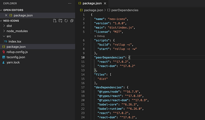
Finally edit our package.json
# edit this line to point to our dist folder which will be generated after build
"main": "dist/index.js",# add this
"scripts": {
   "build": "rollup -c",
   "start": "rollup -c -w"
},
"peerDependencies": {
  "react": "^17.0.2",
  "react-dom": "^17.0.2"
},
"files": [
  "dist"
],
Then run yarn build in the same folder, should be able to see a “dist” folder being generated. Make sure your peerDependencies react and react-dom is copied from devDependencies and have same version.
Now our package is ready, incase you want to test it before publishing our package, just create a simple react project from here https://reactjs.org/docs/create-a-new-react-app.html.
Testing package
create a simple react app as per the docs on reactjs website above, or can follow below.
npx create-react-app my-app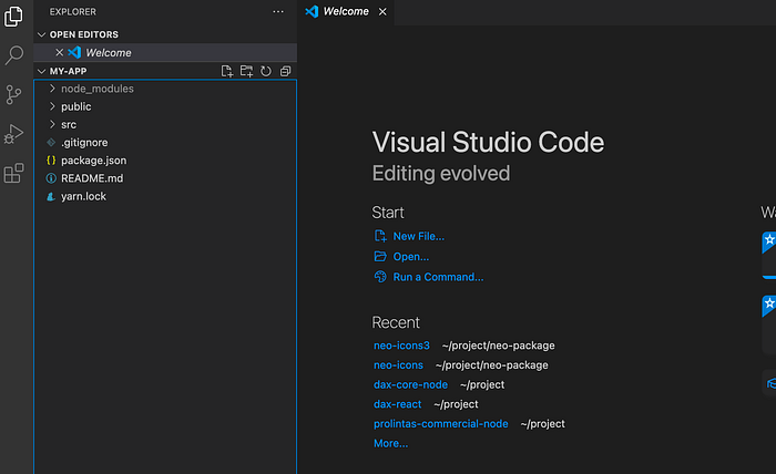
Should be able to get the default boilerplate of create-react-app and if we serve this with yarn start we can see the default page ready by react template.
For test purposes we will be changing the react icon with our package icon. To do that without publishing first, we have to source link it to make our project able to recognize the package. Officially later we have to publish it, so that other projects can yarn add our-package.
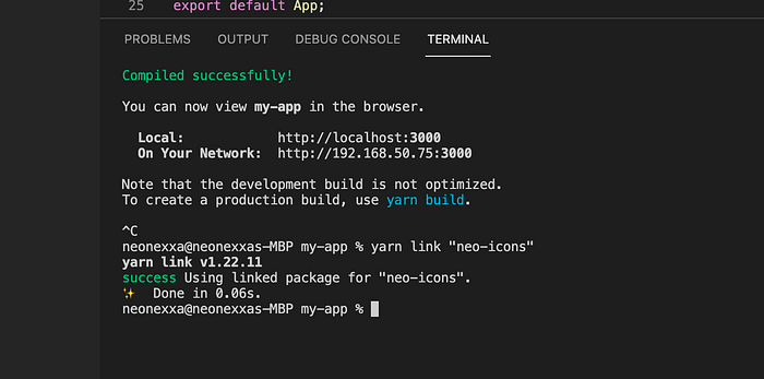
To source link our package for testing, go back to our package folder and run yarn link. This will expose our package to be available to any project in our environment/workspace. You should get an output similar to:
You can now run `yarn link "neo-icons"` in the projects where you want to use this package and it will be used instead.Then go to the sample app my-app and run yarn link “neo-icons”.
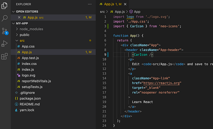
Next go to App.js in src folder and test our icons since that is where previously our default react icon was written by the template.
import our icon in destructured mode since we might not need all other icons from that package (if we have more than 1 icons from that package)
# add after other imports
import { CarIcon } from 'neo-icons';# add our CarIcon as component in any place we like, ideally just replace the original icons of react that keeps spinning :D
<CarIcon />
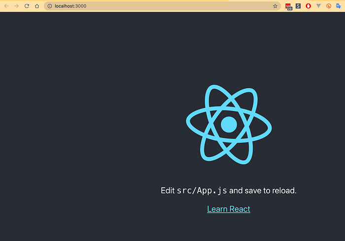
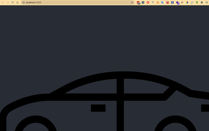
Below is how it should roughly look like.
and we could see our icons when we serve it yarn start .
Just to make sure our props passing properly to the icons, we can pass the same attribute like the react spinning image have previously.
className=”App-logo” to the CarIcon component in line 9 below
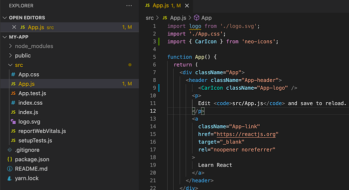
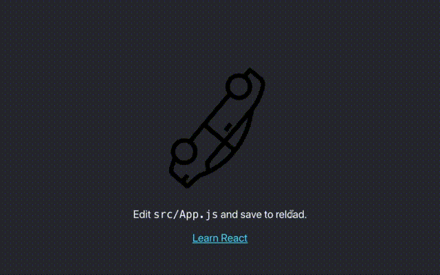
Tada!!!.. if no more doubts, can just delete our sample app my-app .
Publishing our package
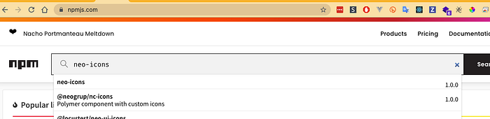
Thats it!! now go our package folder and review the package.json for our package, make sure to see the name and version appropriately to your actions. Run:
yarn publishWait a few secs, and it should appear in the public packages.
Now the developers can freely add your package to their projects by yarn add your-project like others.
Thanks for reading this..